QCPA 2023 Media Excellence Awards
QCPA 2023 Media Excellence Awards
May 26, 2023 | QCPA Awards
Held 26th May 2023 at The Pullman Hotel, King George Square, Brisbane
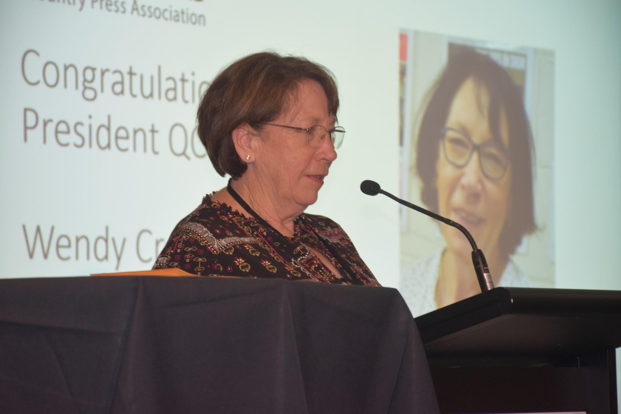
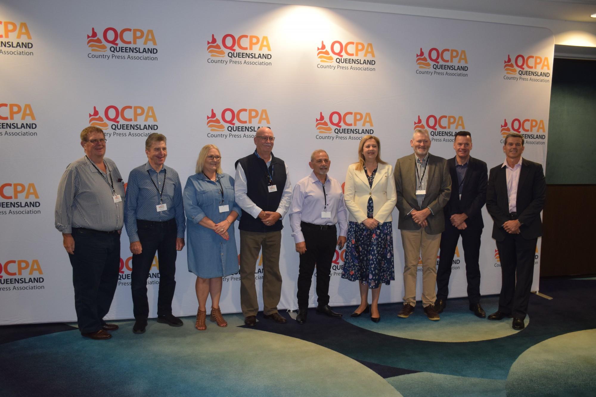
The QCPA annual conference and award night attracted 134 guests from throughout our 59 member base plus interstate guests. We were honored and delighted to welcome Queensland Premier and Minister for the Olympic and Paralympic Games Annastacia Palaszczuk MP who opened our 115th Annual conference on Friday morning.
2023 Award Winners
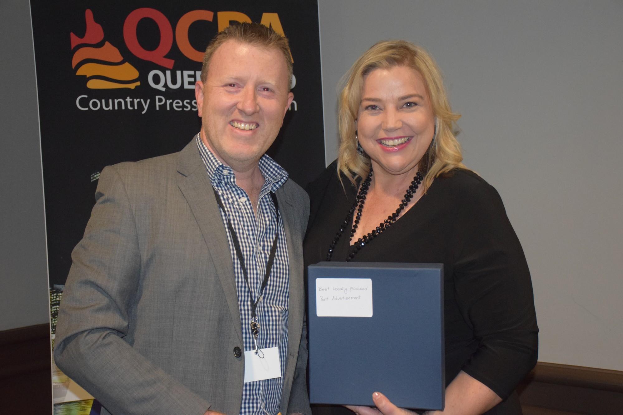
Best Locally Produced Print Advertisement
Judge Renee White
Overall Judges Comments
When judging this category, there were a substantial number of entries and I was looking for advertisements that grabbed my attention straight away, just like a reader would when reading the paper. Our readers need to have their attention caught in an instance through creative catch phrases, clean but effective layouts, different colours and imagery. Many of the entries were well designed and you can see the effort put into creating them but some adverts had too much information.
From an experience point, I was judging not just on the look of the advert but on the creativity and selling of the sales message. There were many aesthetically pleasing adverts with great imagery, colour and followed the design principles of an effective advertisement but they lacked that point of difference to stand out through creativity to present the sales message.
The winning advertisements were very well designed and were able to demonstrate that next level of creativity. They were able to use minimal imagery and text but sold their message in volumes.
Winner - Bundaberg Today (Oh what fun it is to ride)
Top marks for this advertisement. As soon as I saw it, I knew it was the winner as it grabs your attention straight away. A simple sales message, simple images combined with the creative execution clearly engages the reader. It easily identifies the sales message to come buy a bike for Christmas without even having to say the words. There is no clutter in the advert and everything is placed perfectly. Clever use of wording for the heading by playing on a Christmas jiggle. I am sure the advertiser would have sold plenty of bikes at Christmas time. All I can say is wow, I love this advert!
2nd Place - CQ Today Weekender (Parkhurst Quality Meats)
A simple but effective advertisement. It focuses on one key point and is not cluttered. The advert content flows well from the attention grabbing headline to the business details. Nice play on words. The message was clear that customers can now shop online 24/7 for their meat. The bold headline at the top of the advert clearly states the sales message. The advert could be enhanced with the website larger and as part of the call to action or a QR code to make it easier for readers to scan and shop. Well done!
3rd Place - Mackay and Whitsunday Life Newspaper (Karen Hill Foral Design)
A beautiful advert to promote Mother’s Day. Understated colours that give an emotional warmth to the advertisement with the ribbon and bow clearly stating the advert is about gift giving. It is nice to see these shades of colours used in print advertising. The message is very clear and simple. The advertisement does what it is meant to do without having too many elements or wording. The creative idea to “wrap’ the advert took it to the next level. Well done.
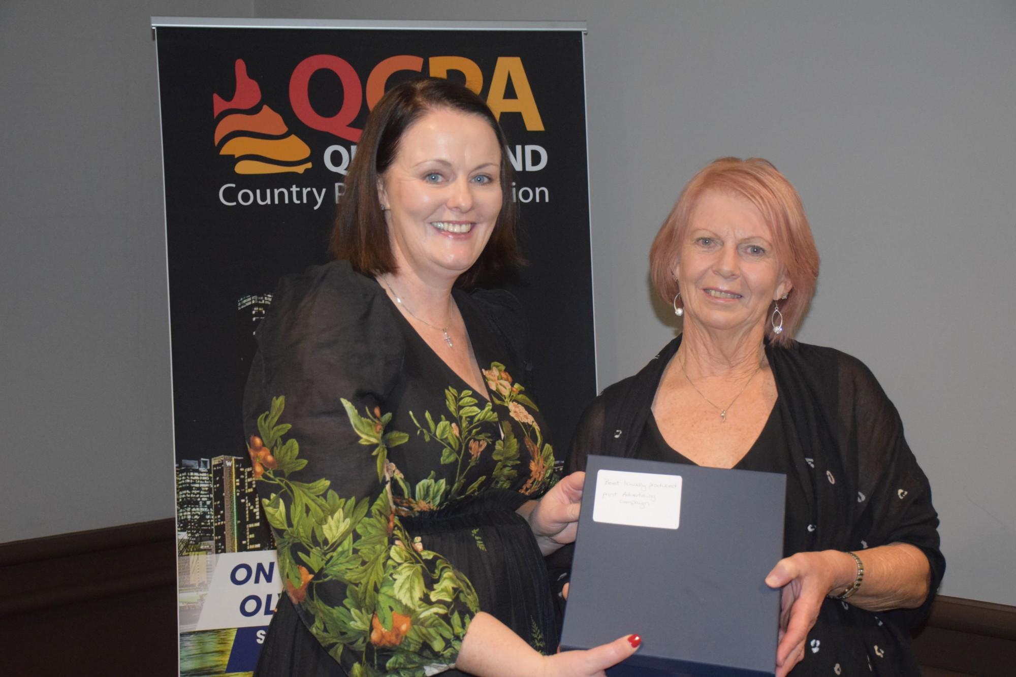
Best Locally Produced Print Advertising Campaign
Judge Renee White
Overall Judges Comments
It was a pleasure to judge the Best Locally Produced Print Advertising Campaign. There were many great ideas presented. The top three winners were the standouts because they followed a simple design formula with brand consistency and focusing on one particular target per advertisement. The overall standard of the entries supplied were of a very high quality. You can see the level of care and effort in producing the campaigns.
Unfortunately, there were many entries that had only supplied one advertisement in the campaign making it hard to judge the reinforcement of the message and strength of campaign. It would be beneficial to enter the 3+ advertisements to support the entry.
A special mention to Bundaberg Today for the “On the Tongs” advert. A very appealing, creative advert design with a catchy headline which was backed up by a photo of the real estate agency with a pair of tongs. Very clever. It would have been great to see the other advertisements in the campaign.
Another special mention to The Canungra Times for the My Country Escape advert. It had all the elements of a winning advertising campaign and was beautifully designed but would benefit from the template being reversed with the business details at the bottom of the design.
Winner - Furniture Court - Bundaberg Today
Catchy slogans with the slightest quirk capture the eye and are supported with appropriate imagery. The advertisement theme focuses on one key area each and doesn't leave the reader bombarded with too much information. The layout is retained through the entire campaign to keep the customer's brand top of mind. The campaign featured relevant images and messages that reflected the intended audience. Adding photos of the local business’ team added an element of personality which reinforces local.
A simple layout executed well with brand consistency and simple elements but brought to life with catchy, relatable slogans and large imagery. Great job!
2nd Place - ARB Caboolture - Moreton Bay News
If you were a 4WD enthusiast, this advert would stop you in your tracks. Again, it follows a simple layout - heading, brief body text, image and business details. There is minimal text but the images do the talking. The campaign consistently reinforces the business is selling 4x4 accessories by ensuring a 4WD picture is present in every advertisement. The consistency of the branding and template is retained throughout the campaign which creates familiarity and brand identity.
3rd Place - Digital Health Check - Noosa Today
What could have been a very standard, serious advertisement was turned into a fun campaign. The message was clear “get a digital health check’, but it stops the reader and engages them with light hearted messaging and images. It is what is needed to break through the abundance of messages and capture the attention of the reader. It is a very simple layout but the branding and sales message is reinforced through the campaign.
As a house advertisement to promote digital health checks it serves two purposes engaging the reader to get a digital health check and demonstrates the quality of advertising design and creativity the Noosa Today team can offer to their advertisers.
Best ROP Newspaper Feature/Supplement
Judge Pascale Budge
Overall Judges Comments
An excellent variety of local topics covered in this large section some diving into much more detail than others. It was great to see lots of strong features in this category. Generally, well written and interesting editorials, engaging stories and supported by relevant advertising.
Keep in mind that captions are a very important part of the story, finer detail gives you greater insight into the picture. Advertising was strong and relevant across majority of entries. In some of the pictorial features the great designs could have been complimented with editorial giving greater strength, depth and insight.
Winner - Noosa Today – Noosa Festival of Surfing
This feature made me want to jump on a plane and attend the Noosa Festival of Surfing. Editorial was well written to the target audience. The layout was aesthetically pleasing with well thought out colour schemes and style.
Supported by well designed, eye catching ads, that worked in with the overall layout of the feature. Well done.
2nd Place - Mackay and Whitsundays life – Great Barrier Reef Festival
Eye catching and fun. The front cover of this feature really caught my eye. Stories were very informative. Highlighting each event gave me a great insight into the festival. A lovely feature supported by nicely designed advertising.
3rd Place - The Lockyer & Somerset Independent – Your Town 2022
A great 6 week shop local promotion, featuring stories and advertorials focused on locals for locals. This was evidently popular and well supported amongst advertisers. Clearly laid out with a great number of ads.
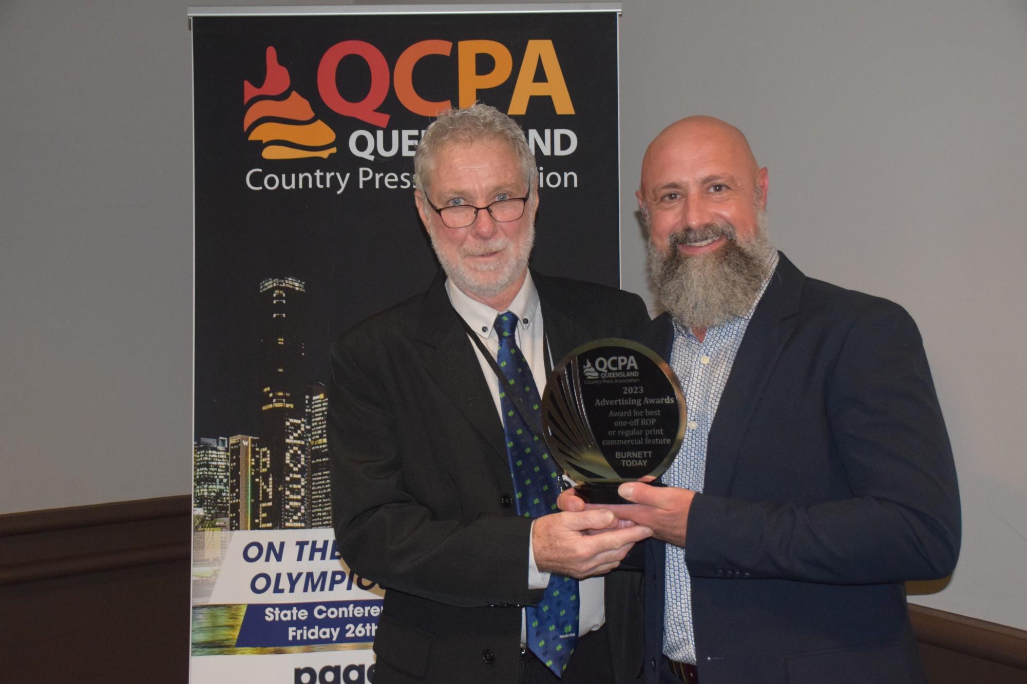
Best One Off or Regular Print Commercial Feature
Judge Pascale Budge
Overall Judges Comments
A wide variety of topics and sizes in this section. It was lovely to see so many local businesses getting behind these features. A strong sense of community connection really came through in all of the entries, with engaging stories and relevant photography. Overall advertising was well targeted to the feature themes and businesses would have benefitted from being involved.
Winner - Burnett Today - Nanango Stags
A great range of stories covering 110 years of Nanango Rugby League Football Club. Covering all aspects of the club, upcoming events, information on coaches, up and coming young players and interesting reflection, memories and stories published in the past. Readers would have enjoyed this insight into what makes up this local football club. Clearly laid out with strong advertising. Advertisers were very proud to be supporting their local football club. Well done
2nd Place - Noosa Today – International Women’s Day
Nicely laid out and powerful editorial. This really spoke to the reader about what International Women’s Day means to these businesses. Well done
3rd Place - Beaudesert Bulletin – Father’s Day
This feature showcased its advertisers well. The editorial playing on “dad jokes” was a nice touch. Clean and clear layout supported by strong ads.
Best Printed Community Advertising Promotion
Judge Andrea Graham
Overall Judges Comments
The support for local communities by newspapers was impressive. There were some very detailed and well thought out campaigns. While some entries were not well supported by advertising they certainly sent their message to the readers. There was some over-use of strong colors making details harder to read while others had very clean creative layouts.
It is so important for our industry to have a strong presence in these community events. Overall, some great ideas. Well done.
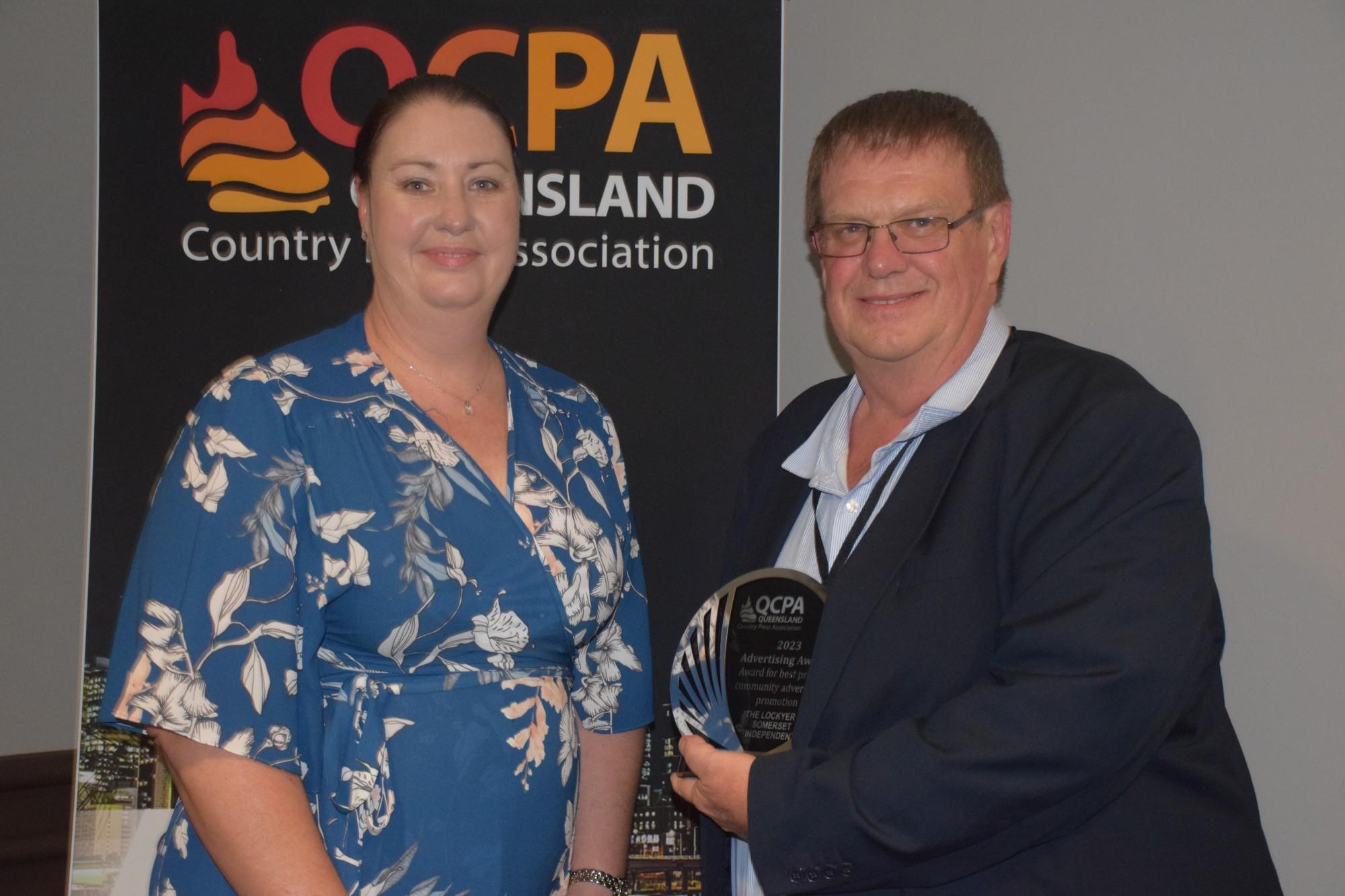
Winner - Your Town - Locker & Somerset INDEPENDENT
28 pages totally supporting local businesses. This is a fantastic initiative by the publisher. Local advertisers from the local regions all participating in a promotion, making this a very well supported publication. You can’t go past throwing out some cash as an incentive for folks to get on board. Any town promotion in regional Australia can only be of great benefit to all. This is a real collaboration between business, local government, publisher and the readers. Well done.
2nd Place - Maleny’s Mobile Come & Try Day – Glasshouse Country & Maleny News
What an amazing way to bring a community together. The message for the Come and Try Day was simple and effective with excellent promotion in print, digital and social media leading up to the event. Congratulations on taking the lead in showcasing your local groups. This is a novel idea and one that we perhaps should all try in our own communities.
3rd Place - Just What You Need – Happy 90th Birthday 4RO – CQ Today
It’s great to see two opposing media outlets working together to promote the region’s voice. A great joint effort CQ Today and 4RO promoting local businesses, utilizing QR codes for competition entries with one lucky winner taking $2000 worth of fuel and grocery vouchers. Getting the community involved and participating in promotions is what brings them back to you. Simple and effective advertisements enhanced by small editorials for each business.
Best Printed House Advertisement or Promotion
Judge Rob Duffield
Overall Judges Comments
This category, as was the case last year, showcased a high-quality selection of very well executed in house advertisements and promotions from Queensland members. It was pleasing to see the wide-ranging creative ideas produced. From a very innovative digital concept to localized subscription promotions and 25 words or less reader competitions the ads and promotion concepts were well researched and written and had real impact. Many of the ideas and concepts can be easily replicated by regional news media entities across regional Australia. Well done Queensland members! Keep up the good work. This is a category that is often not given the credence it deserves.
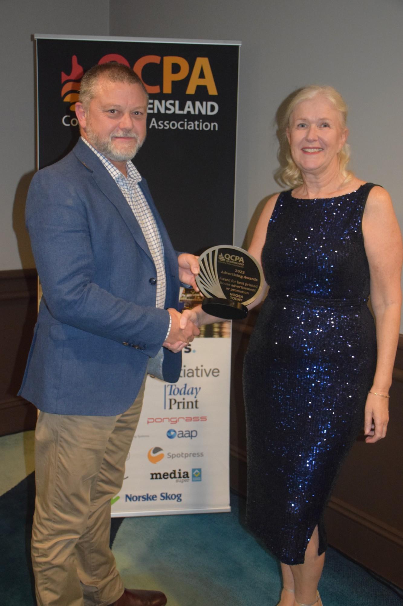
Winner - Noosa Today (Your Digital Health Check)
The 'Leave it to the professionals' campaign is an absolutely outstanding camapign which would have naturally attracted the attention of local business owners. Fantastic headlines on all ads with complimentary and value adding images. What a beautiful unique fresh campaign on digital. Something out of the box in my view. Congratulations to the Noosa today team.
2nd Place - Bundaberg Today (Subscription Drive: Rum & Sub)
I loved this entry which captured so well what every news media publisher should be doing in ongoing circulation promotion. Fantastic with an easy call 1300 number suplyed to easily freely ask for the deal. The product Bundaberg Rum is a standout giveaway in the Bundaberg market space. I would love to know how the offer went?
2nd Place - Burnett Today (Sexual Violence Awareness Campaign)
A winning entry theme from last year's awards which is amazingly well researched and thought out. Designed as a self help guide and message of HOPE for sexual violence victims and prospective victims. This is a right and just campaign for a local newspaper to promote to its communities. Extremely well done Burnett Today team, All newspapers across the country should copy and paste and adjust this idea for their markets.
3rd Place - Noosa Today (Locals love local property!)
What a great Noosa Today real estate campaign to bust the realestate.com/ other .com bubble. Such a local take on their markets newspaper property coverage with clearly stated benefits and reasons to engage for property through the local newspaper. loved the agent's testimonial and five tick points on the main advertisement. Superb.
Best Special Publication
Judge Andrea Graham
Overall Judges Comments
Overall, there were some excellent entries in this category. A great range of publications from well-designed local maps and calendars to promotions and of local events.
It was pleasing to see so many community-focused publications. The Sunshine Coast’s Seniors Today and the Burnett Bridal Guide and CQ Wedding expo covered almost every topic and the advertising was very relevant to the theme. Real Estate and local shows were well represented with some classy publications. Special mention to CQ Today’s Rockynats News, Warick Today’s Leyburn Sprints, Longreach Leader’s Enrolments Guide. There was a strong number of such good quality publications.
The Gympie Floods publication gave back to the community with part of their sales going back to the flood victims. The photos were amazing. It was certainly a publication that would tug at many hearts. A sad, but lovely tribute.
Love the work of the Queensland publishers. Keep up the great work.
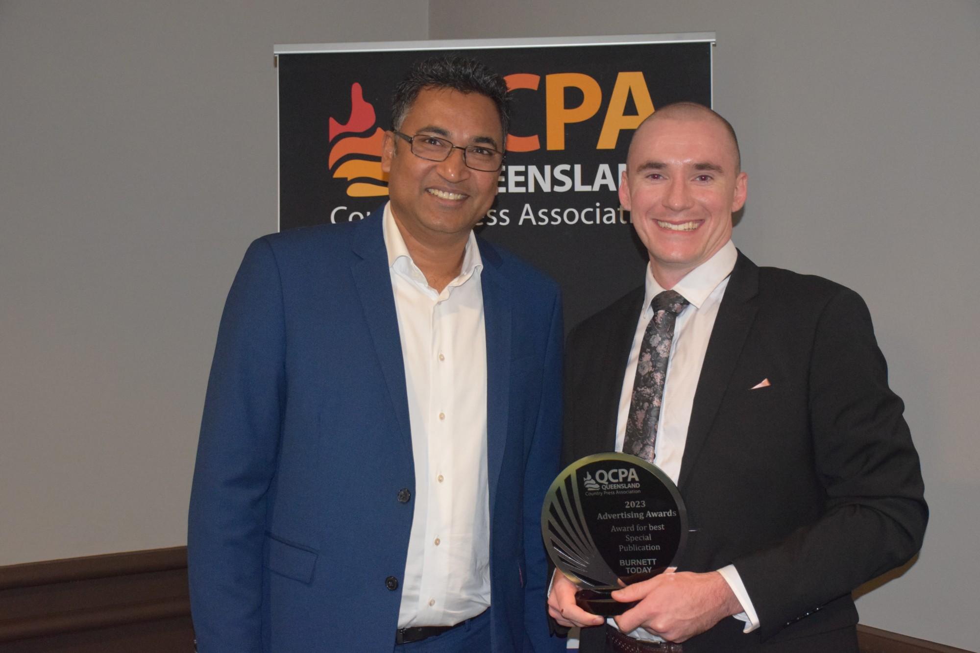
Winner - BaconFest Book (Burnett Today)
40 pages dedicated to a Bacon Festival! Editorial content was all relative to the event with some messages from local figures and original articles from the publisher’s journalists. Some very creative graphics were used to add to the clean layout of advertisements and editorials. Whimsical headings on some stories and advertisements added to a ‘fun festival’ vibe in this classy publication.
2nd Place - 2022 Gympie Muster 40th Birthday Official Souvenir (Gympie Today Pty Ltd)
A high quality publication supporting a major local event. Editorial content was concise. Jam packed with messages from local identities plus 40 years of the event’s history, programs, schedules, timetables and a map. Well supported with strong advertising and a front cover that would grab anyone’s attention. This would no doubt have contributed to the event’s success.
3rd Place - Today Magazine (Bundaberg Today)
Very refreshing to see publishers not be afraid to use white space. The layout and design was superb. The editorials were easy to read and covered a variety of topics, making it interesting for a variety of readers. Good advertising support. This one delivered a little bit of something for all readers.
Best Editorial Campaign
Judges Alison McAdam and Kristy Hess
Overall Judges Comments
There were many important community issues covered in the submissions for this category, including bank branch closures, council misspending, domestic violence and protecting sacred sites. The campaigns that stood out where those that focused on very local issues where the masthead was one of the only avenues the community could turn to to amplify their message. While there were many good examples of series of stories that reported on an issue, the strongest entries in this category were those that took a proactive approach and had planned a clear campaign strategy.
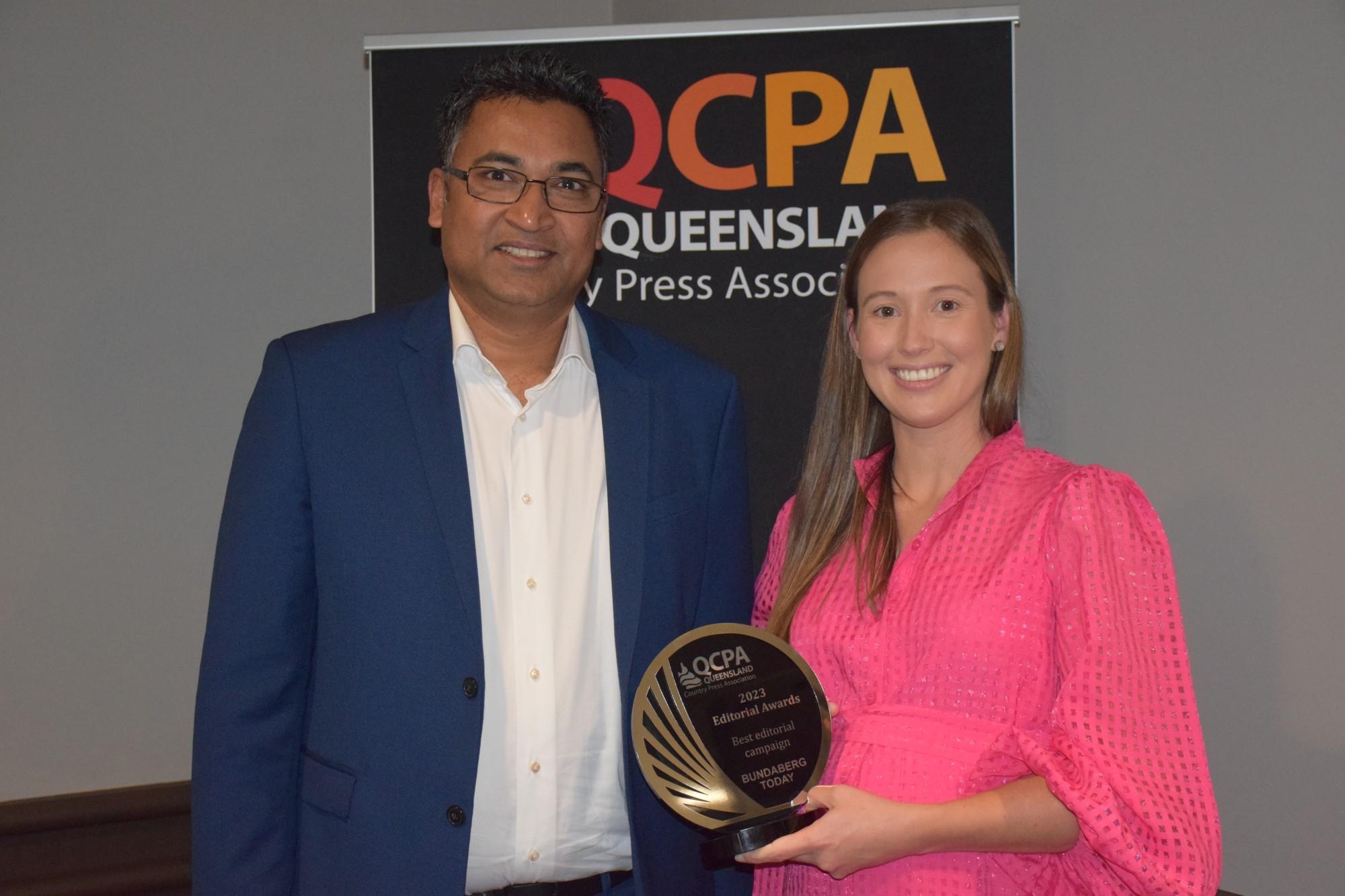
Winner - Bundaberg Today - Demolition of the Anzac Pool, and the proposed construction of a new Bundaberg Regional Aquatic Facility.
This entry showed a continued and comprehensive campaign that involved putting pressure on the council, getting a Federal MP to intervene, and seeking Right to Information documents. This was a dogged effort by the masthead that ensured every avenue was explored, and people in power knew the community's concerns.
2nd Place - Beaudesert Bulletin - Community-led push to reopen Duck Creek Road for safety, economy and local connectivity.
The planning that was undertaken to launch this campaign made this entry stand out. A meeting of residents and key stakeholders was arranged by the masthead, a series of photos was taken, and a logo was created. These actions provided a foundation for a solid and sustained campaign that presented a compelling argument via multiple voices and perspectives.
3rd Place - Mackay and Whitsunday Life – Homelessness
This campaign had a clear aim - to connect homeless people to services that can support them. It comprised a good mix of stories, including those that presented personal insights that humanised the issue.
Best Single Story by an Individual Journalist
Judge Peter Owen
Overall Judges Comments
A total of 24 journalists entered this category, nearly half of whom submitted the full allowance of four stories. In the main, the quality of entry was disappointing – many journalists seemingly believing the length of their articles to be an indicator of their worth. There is nothing admirable about writing 1000 words on a subject that warrants no more than 150.
It was also disappointing to read so many entries with incorrect punctuation, grammatical errors, unnecessarily capped words, poor sentence construction and, often, dull prose – particularly in stories that these journalists considered to be their best.
There were, however, a handful of outstanding entries – tenacious, investigative reporting that threw a spotlight on a corporate cover-up; a journalist’s beautifully written, moving tribute to her deceased father; a wonderful account of a man’s horseback trek around Australia that is so inspiring it could actually change readers’ lives; and a remarkable, graphically told story about a woman recovering from life-threatening injuries.
There just weren’t enough of them.
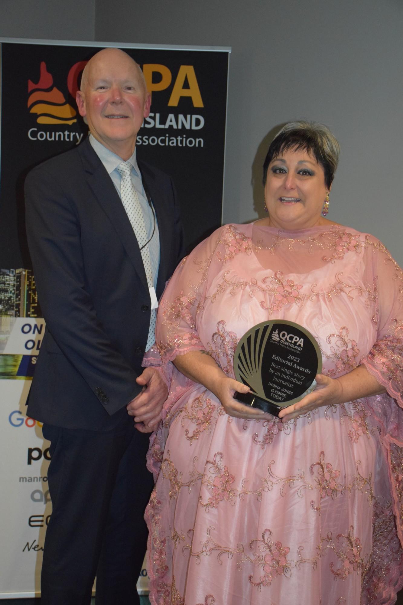
Winner - Donna Jones (Gympie Today Pty Ltd)
I've always believed obituaries are an under-rated source of great stories, and Donna Jones' beautiful tribute to her dad shows why. This is a lovely story, wonderfully written with emotion, love and even a little humour. It's entertaining, interesting and educational - who knew, for example, that you could make a diamond out of human ashes? It surely took Donna Jones some courage to write this article, but everyone who reads it will be delighted she did.
2nd Place - Brian Bennion (The Ipswich Tribune)
A meticulous and responsible piece of investigative reporting that seems to indicate a cover-up by A. V. Jennings, and perhaps other authorities. It's a long piece, and takes some digesting, but it's an important story, where every avenue has been explored by the reporter. The research is thorough and the reporting tenacious. A good example of why newspapers are vital as a custodian of people's rights and interests.
2nd Place - Wendy Creighton (The Fassifern Guardian)
Wonderful story, beautifully told. It's very long, but once you start reading it's hard to stop. There are some grammar glitches and unnecessary random capital letters, but that can be excused as the story is so gripping - even inspirational. The key to good writing is the ability to tell interesting stories and engage the reader. Wendy Creighton succeeds admirably.
3rd Place - Leonie Fuge (Stanthorpe Today)
Judges were asked to comment only on the three highest place getters, but I felt Leonie's entry deserved special mention. This is an outstanding piece of reporting, and a superb tribute to a local newspaper that was so trusted by the subject of the story that she was moved to tell her traumatic story to it alone. Excellent reporting - graphic in parts - and intensely readable. The sidebar, however, which denigrated other sections of the media, added little to the merit of the entry.
Journalistic Excellence for an Individual Journalist
Judge Peter Owen
Overall Judges Comments
There’s a considerable gulf between the best and worst of the entries in this category. Many entrants submitted work that was verbose and rambling and contained material that was repetitive and often irrelevant. But there were a handful of entries that ticked most of the boxes.
Though it’s not always appreciated in some areas of contemporary media, the ability to tell a story well is, and always will be, at the heart of good journalism. Story telling is the very essence of our craft and should be encouraged and applauded.
It was a pleasure, therefore, to review the work of Wendy Creighton and Phil Jarratt, whose long but compelling stories about a horseman making a four-year trek around Australia, and the background to a woman who stole $600,000 from a Noosa restaurant, were packed with interest, and a pleasure to read.
Tahlia Facer submitted an entry that indicated she is a journalist of fierce determination, unafraid to take on councils, governments and anybody in authority, in the pursuit of justice and in her community’s best interests.
Any of those three would be a worthy winner, but it was not possible to go past Brian Bennion’s entry. In a series of stories, he went into bat for a group of indigenous Australians concerned that a developer would build on sacred burial grounds, and railed against a council seemingly obsessed with spending money on itself, and keeping quiet about it.
It was good, old-fashioned journalism that demonstrated meticulous research, unwavering commitment to the story, and confirmed the role of a newspaper to uphold the interests of the community, and fight for the underdog.
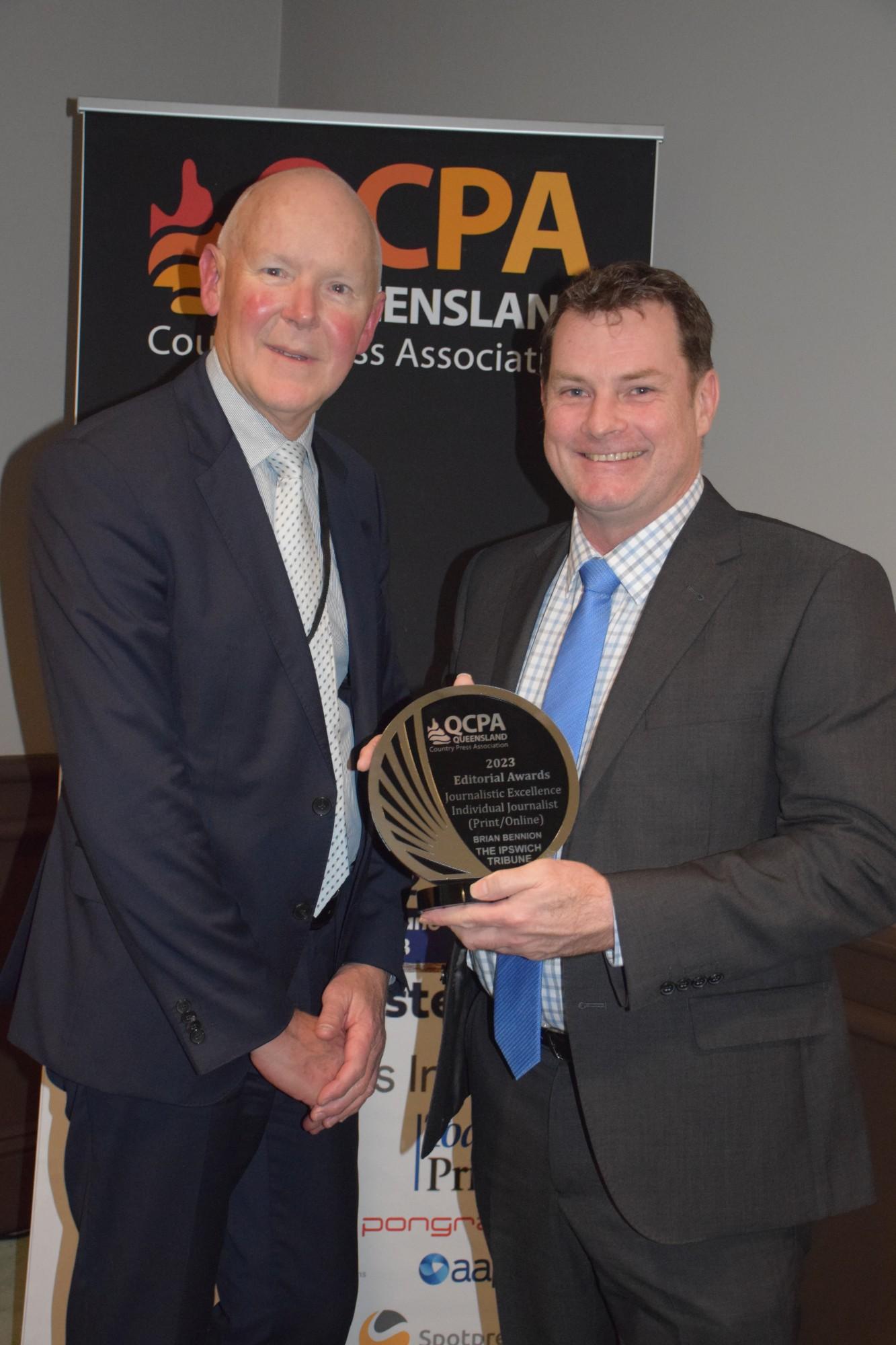
Winner - Brian Bennion (The Ipswich Tribune)
Brian Bennion is a journalist who clearly has no qualms about taking on councils, governments - indeed, anybody in authority - who acts against the best interests of his readers. This entry sees him supporting Indigenous Australians whose sacred land is at risk of dubious development; taking on a council seemingly obsessed with spending money on itself while keeping it secret; and questioning why the same council squandered the opportunity to preserve the heritage of a favourite old hotel being renovated. The body of work demonstrates Bennion's meticulous research, unwavering commitment to the story, and his considerable ability as a story teller.
2nd Place - Tahlia Facer (Bundaberg Today)
Whether or not Bundaberg Council is right to dismantle the old Anzac Pool and build an expensive new water sports complex is not answered in Tahlia Facer's series of stories on the issue. But nobody can say she hasn't examined every aspect of the issue, and canvassed every point of view. It is a commendable body of work that highlights Tahlia's tenacity and enterprise. Similarly, she shines a light on the treatment of Fijian seasonal workers by some agriculture and accommodation operators in another series of investigative stories. Some of the reporting is verbose, and occasionally wanders into areas that seem irrelevant and repetitive, but Tahlia is clearly a journalist who enthusiastically accepts a responsibility to challenge the status quo, seek justice for her readers, and keep the authorities honest.
3rd Place - Wendy Creighton (The Fassifern Guardian)
This entry showcases Wendy Creighron's versatility as a journalist. The feature on the round-Australia horseman is a superb example of feature writing, and her expertise at this genre is highlighted by her story about the reunion of a well-known local family. Her piece about a farmer who won a national farming innovation award became, through dogged interviewing and then clever follow-up, a fascinating story about the foolishness of the Queensland Government in promoting agri-tourism, and then penalising anybody who treads that path. Wendy is a mature, diligent journalist with an inherent interest in her community and a passion to make it better.
Marketing Campaign of the Year
Judge Ben Ready
Overall Judges Comments
“The high level of creativity and technical execution across all entrants made this category a pleasure to judge. Each campaign was unique and clearly developed to reflect the target audience and community. The results achieved were exceptional given the sometimes limited resources available. Thinking outside of the box and taking risks is the key to success of any advertising campaign. One of the entrants (Mackay Life) was a great example of how this risk taking can have huge rewards and help a campaign exceed even the highest expectations.”
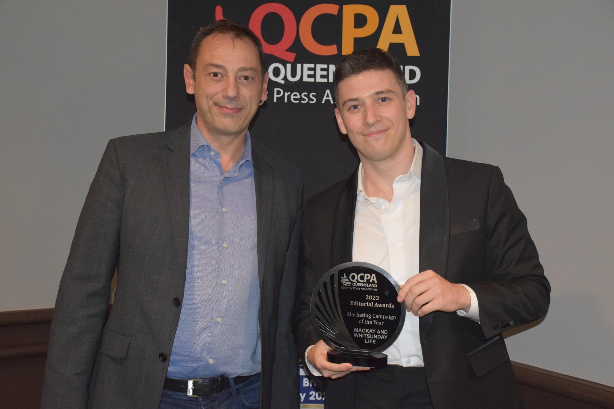
Winner - Mackay and Whitsunday Life Newspaper
A standout campaign that combines great, innovative creative with simple execution. A real "game changer" that sets a new benchmark for the way regional and community newspapers should market themselves.
2nd Place - Gympie Today Pty Ltd
A great example of how community newspapers can play multiple roles in their community, not just as a provider of news and information. The Flood magazine provides a great model for other newspapers how they can use their brand and networks to not only achieve good commercial outcomes but help build community spirit and recovery.
3rd Place - The Ipswich Tribune
A striking campaign that oozes creativity and authenticity. The use of 'real' people in campaigns is never easy, but always worthwhile. and this campaign does it brilliantly. Excellent technical execution from the photography to the design and content made this campaign stand out.
Overall Journalistic Team Excellence Award for a Newspaper
Judge Peter Owen
Overall Judges Comments
Too many newspapers published stories that were too long – grey slabs of daunting text, often appearing below a single deck of headline - that do little to encourage the reading of them.
If our aim is to engage our readers then give ourselves a chance by offering a wider selection of stories, covering diverse interests. We cannot do that if we’re dedicating whole pages to a single item. We’re devoting too much space to too few stories, and we’re not injecting the human element into enough of them. Rather, our reporting is generally dull and institutional.
Our journalists are clearly working very hard to cover their patch and their endeavour cannot be faulted. But it takes no more time – or, perhaps just a tiny bit more - to craft a story with an interesting angle, write an intro with an element of intrigue, and construct a piece that flows seamlessly from paragraph to paragraph, with the certain outcome of attracting greater readership.
And let’s try to present pages that are interesting to behold, with a focal point that commands readers’ interest, a headline that grabs their attention; and with a hierarchy that allows them to easily navigate the page.
If anyone thinks that’s impossible in today’s frantic newsroom, where everyone’s overworked, just take a look at what the team at The Mareeba Express is attempting – and largely achieving - with every issue of its award-winning newspaper.
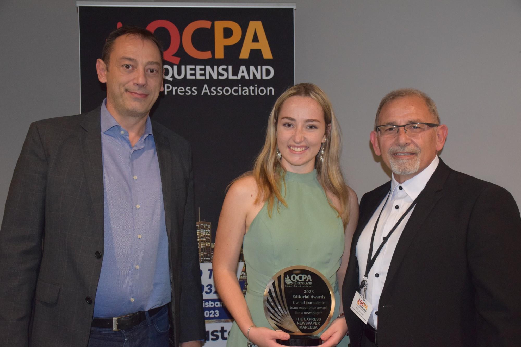
Winner - The Express Newspaper-Mareeba
Excellent coverage of local news, with a consistent focus on telling people's stories, rather than relying on dull, institutional reporting. Stories are well written, generally of appropriate size for the subject matter, and the tactic of running shorter stories allows for a far more comprehensive coverage of local issues. There are excellent sections on agriculture and property, and a healthy mix of community yarns and breaking news. There are some small concerns with grammar (collective nouns take singular verbs, for example, and apostrophes do not indicate the plural), but, overall, this is a newspaper that provides an excellent coverage of the local area, and tackles the task with enthusiasm and pride.
2nd Place - CQ Today
If the award was for the biggest newspaper, CQ Today would win hands down. Its admirable size allows for a range of items that other entrants could never hope to match - including regional, national and international news sections, and excellent monthly inserts on Industry, Farming and Seniors, which obviously are also published in other 'Today' products. CQ Today certainly provides value for money. There are great 'social' pic spreads and a wide coverage of sport. But the reporting tends to be institutional in nature, rather than people-oriented, there are too many inactive 'label' headlines, the Opinion pages are almost exclusively the domain of local politicians, and too many stories just run on and on - way past what their interest level warrants. There is no doubt, though, that CQ Today is a formidable product with something for everyone in every issue.
3rd Place - The Ipswich Tribune
The Ipswich Tribune is a professional product with a mature approach to its coverage of local issues. In the four editions submitted, there were a handful of interesting human interest pieces, but the bulk of the coverage was devoted to political matters - mostly council and state government - and presented in long, long takes. Too much space was devoted to too few stories, though the paper must be commended on its diligent pursuit of justice for those seeking to deny developers the right to build on a site when old human bones had been found and where a massacre of indigineous children is thought to have occured. The Sports section is comprehensive (though some stories are perhaps too long), it's great to see the work of a local cartoonist published, and the paper is consistently enhanced by the superb photography of Lyle Radford.
Young Journalist of the Year
Judge Kristy Hess and Alison McAdam
Overall Judges Comments
The standard of entries in this category is evidence that, across Queensland, there is a network of young journalists with a passion and skill for news reporting. They are to be praised for their ability to produce quality content in times when quantity is often a necessity too.
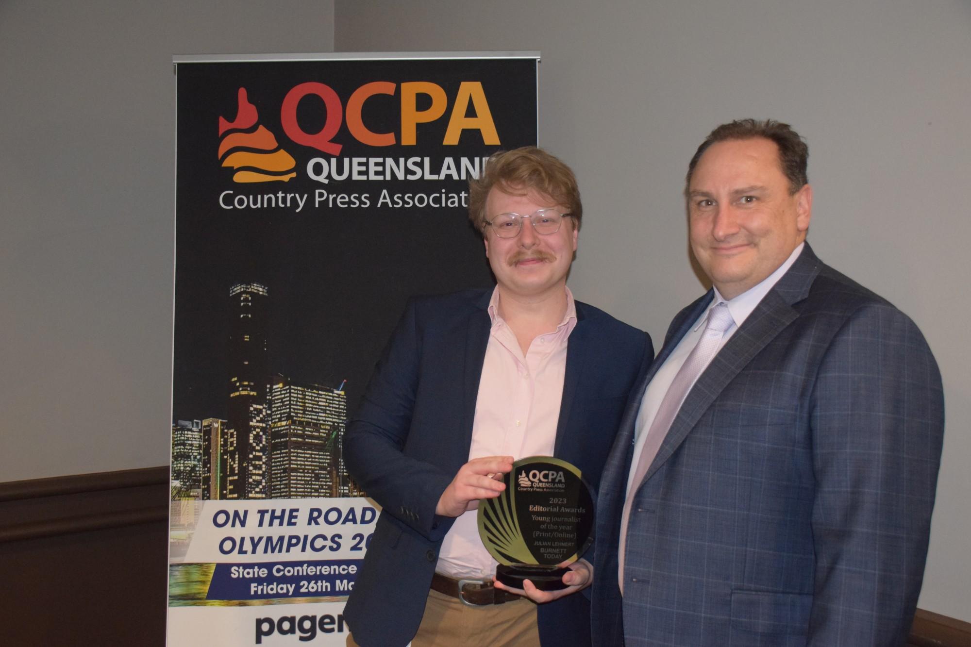
Winner - Julian Lehnert (Burnett Today)
Julian's reporting shows confidence and flare. The entry includes a strong mix of stories. It is clear from these stories that Julian is able to conduct deep and extensive research, talk to multiple people involved in an issue, and is not affraid to tackle difficult or controversial topics.
2nd Place - Ellie Fink (The Express Newspaper-Mareeba)
The breadth of stories in Ellie's entry was impressive, and suggests she has both a high level of creativity and adaptability. The entry included stories that ranged from crime to fashion, and required feature writing skills as well as the ability to handle statistics. They also featured multiple, relevant and interesting sources.
3rd Place - Jacob Hayden (The Lockyer & Somerset Independent)
Jacob's entry showed his persistence in following an issue important to his community. The stories in this entry displayed strong writing skills, with many of them having attention-grabbing intros. The multiple sources that featured in the stories added to their credibility.
Best Community or Portrait Picture
Judge John Wilson
Overall Judges Comments
The photographic skill level displayed in this category was generally moderate to low and probably a reflection of the lack of traditional press photographers being employed to do the work.
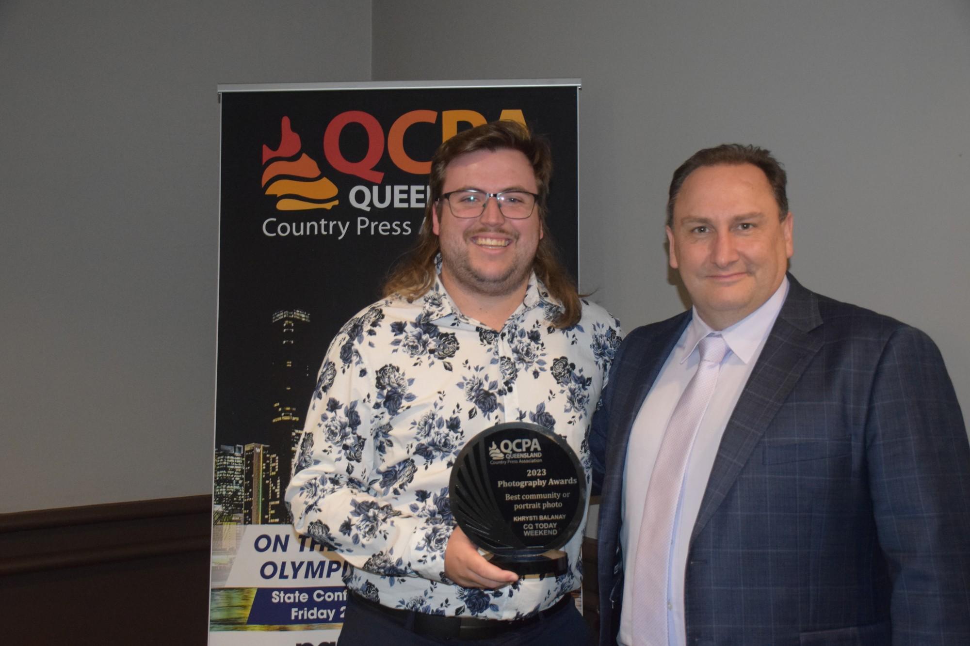
Winner - CQ Today Weekend (Dramatic leap by Khrysti Balanay)
Photographer used good timing and composition to create an image with very good impact to document the story.
2nd Place - Noosa Today (Carrying on the Tradition by Rob Maccoll)
Well framed image to give a sense of place and relevance of the subject.
3rd Place - Gympie Today Pty Ltd (Soggy Show by Shane Zahner)
A good use of action and expression to illustrate the story.
Best News Picture
Judge John Wilson
Overall Judges Comments
A couple of good images but again it was evident that some of the images were poorly framed and showed a low level of technique.
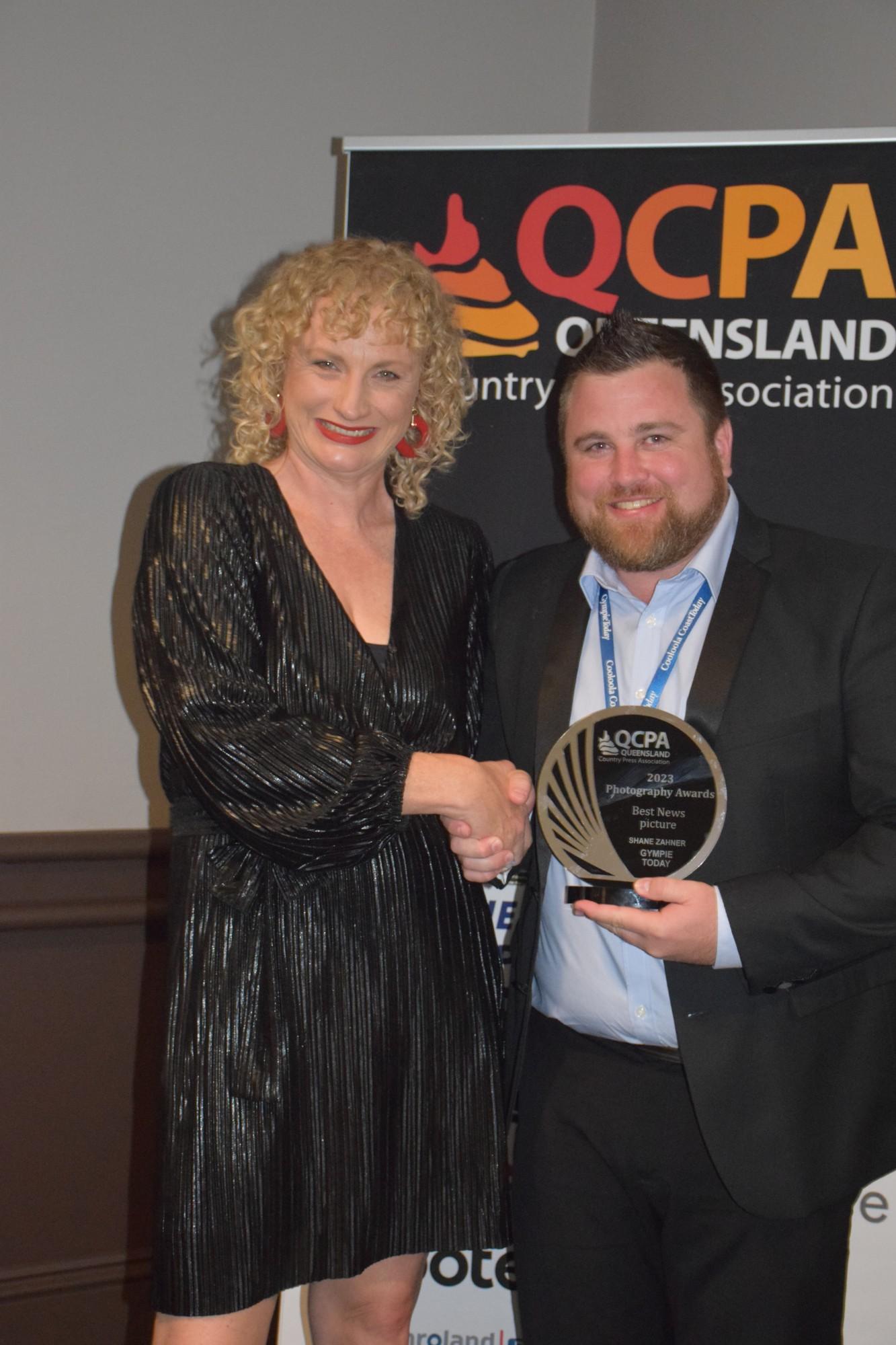
Winner – Gympie Today Pty Ltd (Fire on the Tracks by Shane Zahner)
A good breaking news image to go with a news story about the demise of some town rail history.
2nd Place - The Fassifern Guardian (A horseman's journey by Lyle Radford)
A good portrait to support the subjects story. Well thought out and framed.
3rd Place - The Pittsworth Sentinel (Drama at the aerodrome by Wendy Hughes)
Image has good impact and timing is good. Marked down a little as there is no sense of place to know its actually at the airport.
Best Sports Picture
Judge John Wilson
Overall Judges Comments
Some good action photos entered displaying good use of technique, timing and framing. This category displayed the best images overall in my opinion.
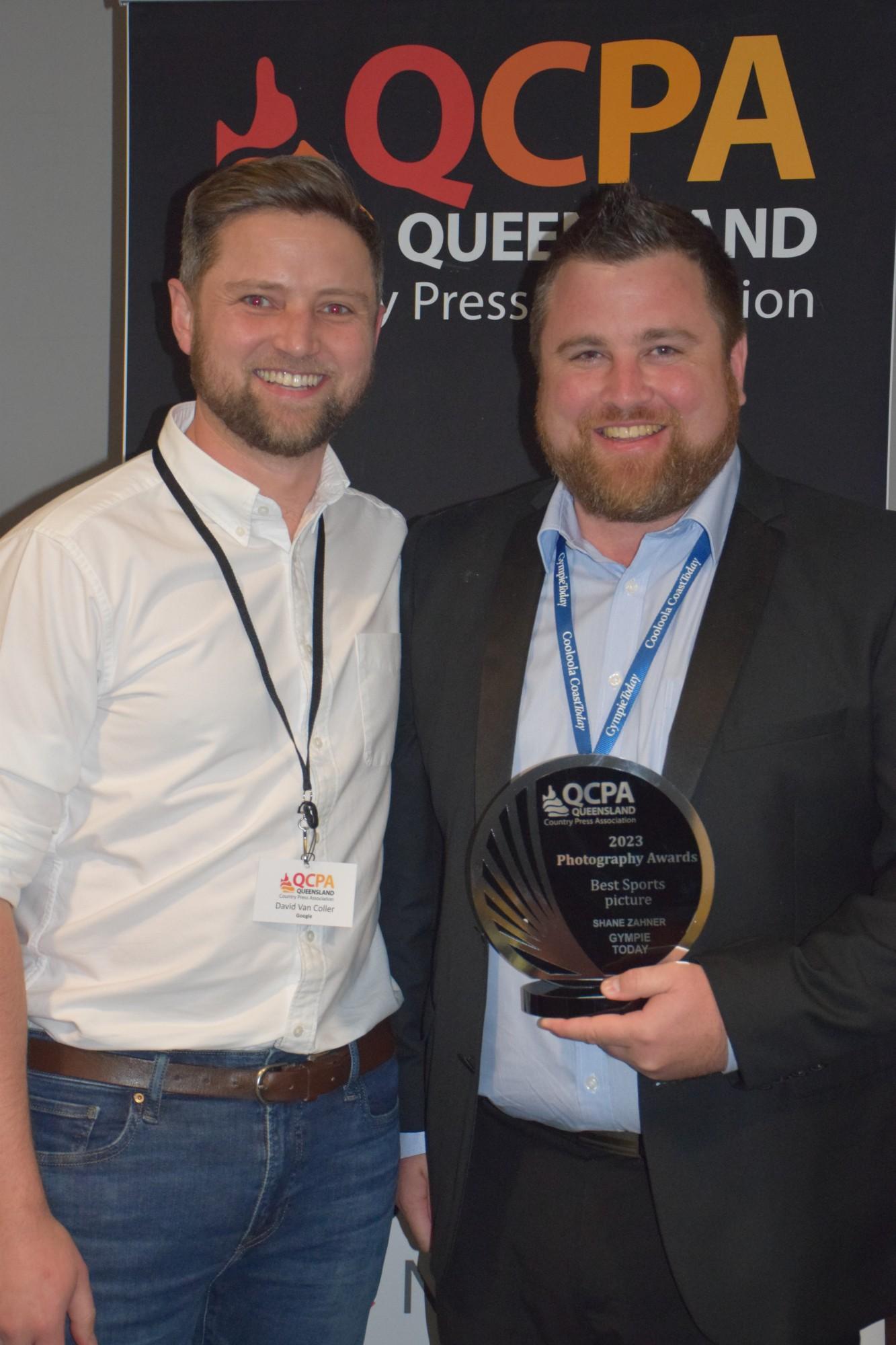
Winner - Gympie Today Pty Ltd (Bring it On! By Shane Zahner)
A well timed and framed action image that has great impact. Well done.
2nd Place - Burnett Today (Keeping cool at Cherbourg rodeo by Jessica McGrath)
A good rodeo action image, nicely framed. Good timing, lighting and camera angle to add impact.
3rd Place - Stanthorpe Today (Hang on by Melissa Coleman)
Good sport image. Timing, lighting, and composition worked well for this photo.
Best Online Digital Presence
Judge Rohan Gosstray
Overall Judges Comments
There was a range of initiatives from flip books and creative use of digital platforms. They were judged on how well each entry promoted their brand, in print and on the internet. Some newspapers showed that they had attracted strong audiences on Facebook and other social media, and it would have been useful (and most important) to show in your analytics how many users had come from these mediums to the website or flip book and how much it had grown over time. Some entries encouraged interaction and used surveys which would also help them obtain unique content for their publications. A recommendation would also be to use the new artificial intelligence public platforms to generate some ideas on how you can use social media to promote yourself and develop your own strategy.
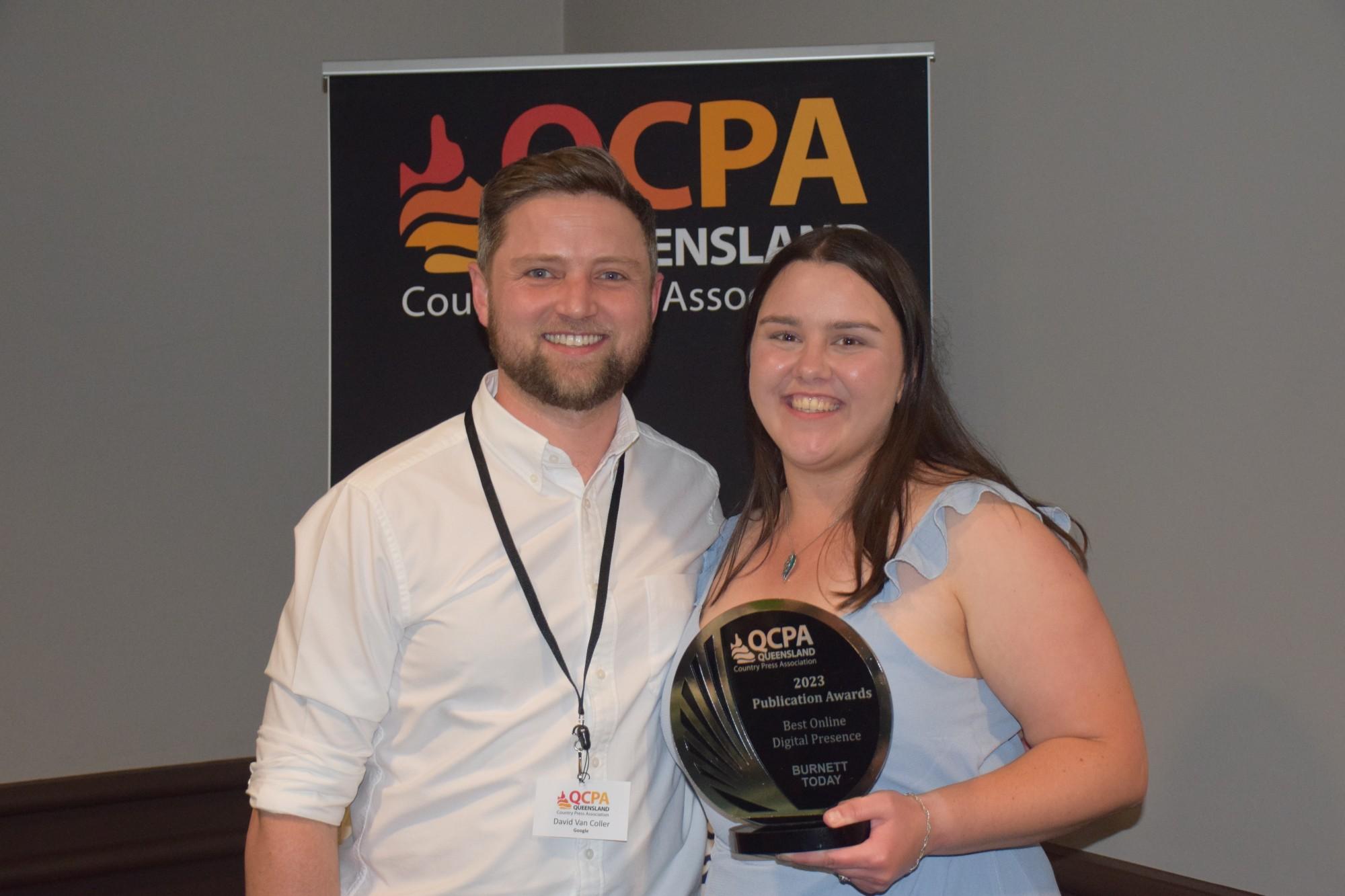
Winner Burnett Today
Burnett Today had an excellent award submission that outlined the strategy behind the digital promotion with an emphasis on encouraging readers to find out more and linking to previous stories on the same subject, with links to website or flip book easily accessible. Promotional posts were written to engage the audience and encourage them to explore more detail on the website or flip book. The content on the Facebook side was fun and engaging without just duplicating what was in the publication.
2nd Place The Express Newspaper-Mareeba
The Express had significant traffic on its Facebook site and it is likely that they generated good traffic for their webpage or flip book, a key measure will be how many of those social readers were encouraged to visit the digital webpage and/or flip book. The addition of digital narration makes the online version more user friendly.
3rd Place Noosa Today Newspaper
Noosa Today was a well-presented website which included a flip book of the newspaper and real estate section. Their social media extended the brand online and was a good promotion for their print publication and website resulting in good readership growth overall.
Best Free Newspaper
Judge Rohan Gosstray
Overall Comments
All free newspapers balanced the commercial reality of making space for good pictures and stories while still maintaining a good mix of supportive and relevant local advertising. Many publications had very solid trade sections and great support from a range of business categories.
These were high-quality entries, that matched both their geographic markets and communities of interest.
In many cases the value of the publications to both readers and advertisers was extended online with digital flip books, unique online content and a digital advertising directory leveraging the local presence of the masthead.
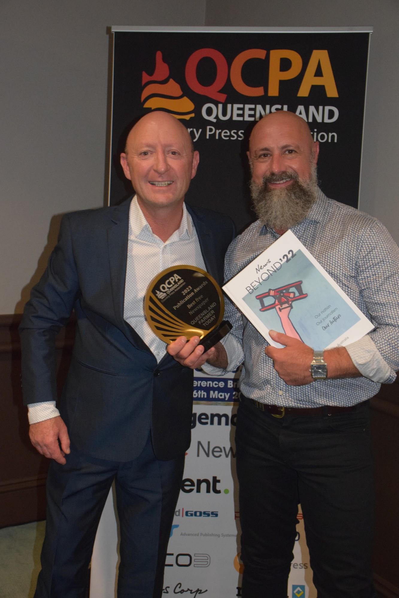
Winner Queensland Farmer Today
Queensland Farmer Today had a good mixture of stories highly relevant to the broad farming community. They had an excellent design with bold headlines and the editorial content ranging from energy to Agri-finance. The photographs were from a range of identities from the region with lots of different smiling faces. The women in Ag section (described as Queensland’s only monthly newspaper for women’s agriculture) was a particularly positive addition.
2nd Place The Express Newspaper-Mareeba
The Express newspaper had bold front pages and front-page pictures to encourage the maximum amount of interested readers to pick up the publication. The publication had solid advertising support with a strong trade directory and a substantial real estate section. The bold headlines and clear layout make it easy for the reader to navigate.
3rd Place Canungra Times
The Canungra Times is an innovative glossy printed A4 format, with a layout that is pleasing to the eyes and supports high quality local pictures. The passionate coverage of the region is obvious throughout the publication. The additions that we looked at contained, bright local features on weddings and dining and the editorial content covered stories from the local council and significant individuals in the community.
Best Paid Newspaper
Judge Rohan Gosstray
Overall Judges Comments
Good local story counts across the board, all publications were backed up with significant online presence and the printed editions had very strong cover prices. Indicating a strong conviction in the quality being produced.
Local advertising told its own story and demonstrated how important local produce and services are to the community, encouraging locals to “buy local” and most publications had solid real estate sections and healthy classified sections creating more value for readers.
As many of the publications were from the same publishers, a distinction was made by identifying which publications carried the most locally focussed stories with supportive pictures and innovate sections.
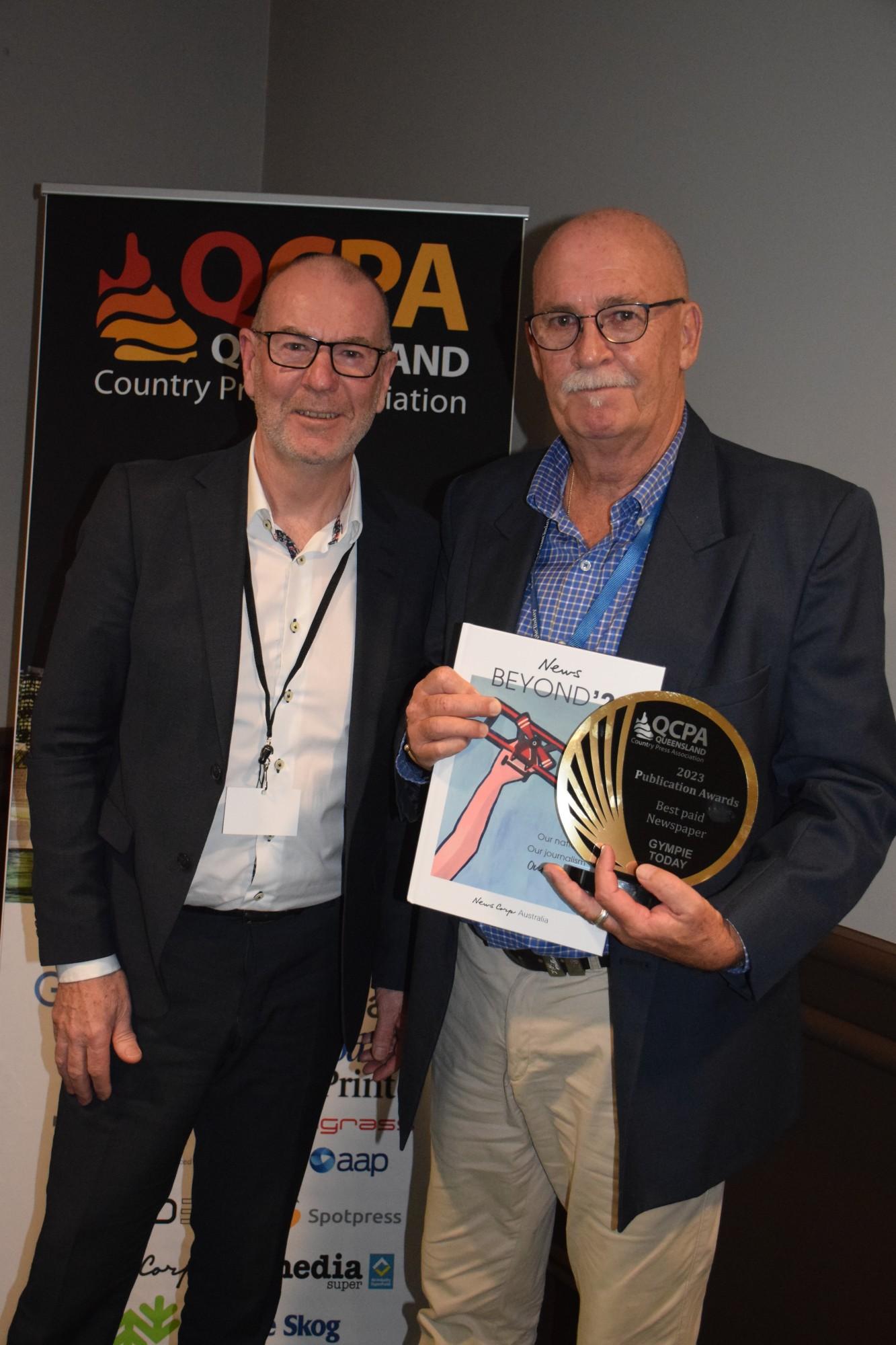
Winner - Gympie Today Pty Ltd
Gympie Today had good front pages, stories had strong headlines with a big supportive picture. Stories strongly focused on local events and people. Excellent layout helps the reader navigate the content easily with well-placed supportive advertising indicating positive local support from the commercial sector. The publication is both engaging and diverse in its content. The headlines displayed good clarity and complimented the design format.
2nd Place - The Fassifern Guardian
The Fassifern Guardian has a unique design that is clear to follow, with headlines and fonts that complement the layout. Good local pictures and diverse content that covers the region in detail. They have a strong agriculture section that covers areas including the scenic rim. Overall, the publication has a very pleasing design that is complimented with good pictures.
3rd Place - CQ Today
CQ Today carries good local stories with supportive bright pictures. Many of the issues that are most important to the region are covered in detail and the advertising support is strong. The publication is a good clean layout, with bold headlines and well written stories.

